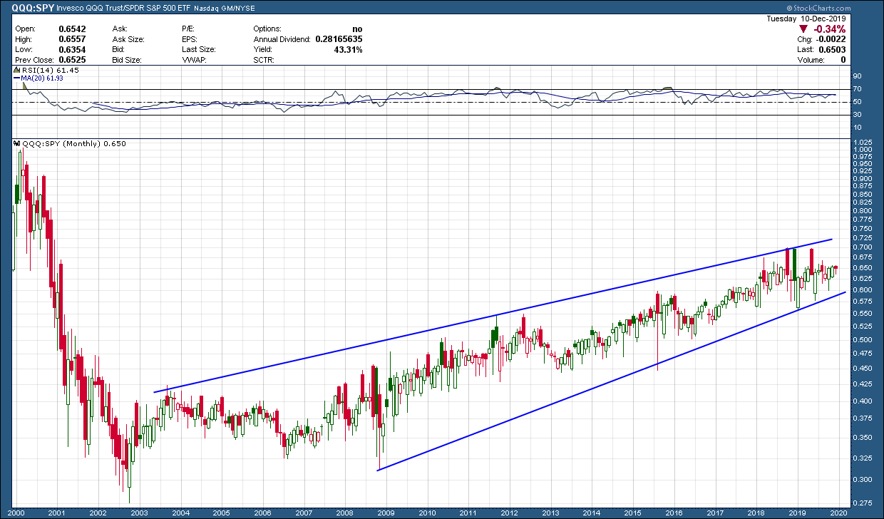
After bottoming in 2003 after the 2000 tech wreck, the technology sector (QQQ) has been the place to be when investing in US equities. As you can see in the ratio chart of the technology index, QQQ, to the broader sp500 index, it has stayed in an upward rising channel the entire time. From that bottom (17 years ago), technology has outperformed the sp500 by more than 130%. There is nothing in the chart, as of now, to say this is changing.
If you didn’t care about diversification and there was a plan on how to manage, it’s safe to say all investors would have preferred the outsized returns that a technology concentrated portfolio provided. The beauty of ratio charts is they can help identify the places to be and more importantly not be, to help outperform when long trends persist.